Make a responsive Navbar with Blazor and Tailwind?
You’ve no doubt seen the “hamburger” icon many, many times.
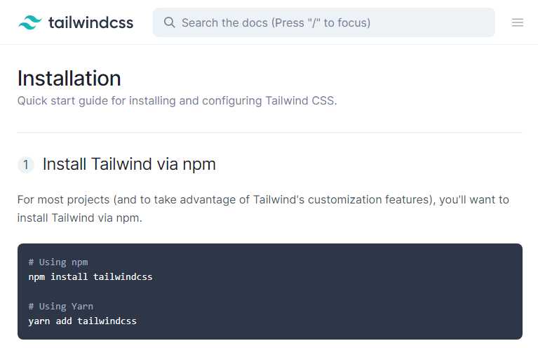
For example, head over to Tailwind’s docs, and you’ll see a full menu (on the left) if you’re using a big enough screen…
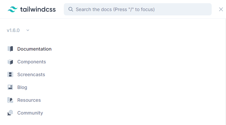
Knock that down to a smaller resolution though and the menu disappears, to be replaced by an icon in the top-right corner.
When you click that the nav menu appears…
Build it using Blazor#
So how can you build this using Tailwind and Blazor?
Well it turns out most of the work here is actually the CSS, with just a tiny bit of code needed with Blazor to make it work.
In preparation I’ve:
- Already configured this example Blazor app to use Tailwind CSS
- Removed all references to Bootstrap
- Modified the MainLayout.razor and NavMenu.razor components to use
flexas a simple starting layout for our example application
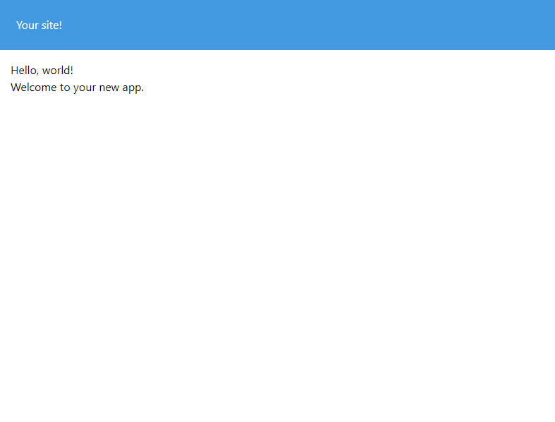
MainLayout.razor
<div class="flex flex-col min-h-screen">    <NavMenu/>
    <div class="p-4">        @Body    </div></div>
NavMenu.razor
<div class="p-6 bg-blue-500 text-white"> <h1>Your site!</h1></div>Which renders this:
Mobile first#
Let’s be well-behaved developers and focus on making this work for mobile first!
We want to display a hamburger icon in the top-right of the nav bar.
First, we can add the icon to the existing HTML to see how it looks…
<h1>Your site!</h1>
<button>    <svg class="h-6 w-6 fill-current" viewBox="0 0 24 24">        <path fill-rule="evenodd"              d="M4 5h16a1 1 0 0 1 0 2H4a1 1 0 1 1 0-2zm0 6h16a1 1 0 0 1 0 2H4a1 1 0 0 1 0-2zm0 6h16a1 1 0 0 1 0 2H4a1 1 0 0 1 0-2z"/>    </svg></button>
Which renders:

To pull that over to the right we can use CSS’s ever-mysterious (but actually really useful) flexbox.
<div class="p-6 bg-blue-500 text-white">    <div class="flex justify-between">        <h1>Your site!</h1>
        <button>            <svg class="h-6 w-6 fill-current" viewBox="0 0 24 24">                <path fill-rule="evenodd"                    d="M4 5h16a1 1 0 0 1 0 2H4a1 1 0 1 1 0-2zm0 6h16a1 1 0 0 1 0 2H4a1 1 0 0 1 0-2zm0 6h16a1 1 0 0 1 0 2H4a1 1 0 0 1 0-2z"/>            </svg>        </button>    </div></div>
By wrapping everything in a div we can use flex and justify-between to arrange all the elements within our nav along the x-axis, with equal space between them.
This essentially pulls the first item to the left, and the next item to the right.

Now what about the actual menu with all our nav items?
In this mode (mobile) we want to show a simple list below the nav bar itself (eventually we’ll trigger this by clicking the hamburger icon).
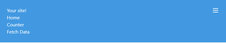
I’ll add the nav links at the end of the NavMenu.razor component.
<div class="p-6 bg-blue-500 text-white">    <div class="flex justify-between">        <h1>Your site!</h1>
        <button>            <svg class="h-6 w-6 fill-current" viewBox="0 0 24 24">                <path fill-rule="evenodd"                    d="M4 5h16a1 1 0 0 1 0 2H4a1 1 0 1 1 0-2zm0 6h16a1 1 0 0 1 0 2H4a1 1 0 0 1 0-2zm0 6h16a1 1 0 0 1 0 2H4a1 1 0 0 1 0-2z"/>            </svg>        </button>    </div>
    <ul class="flex flex-col">        <NavLink class="" href="/">Home</NavLink>        <NavLink class="" href="/counter">Counter</NavLink>        <NavLink class="" href="/fetchdata">Fetch Data</NavLink>    </ul></div>
flex comes in handy again here. Without this and flex-col our nav links would appear next to each other.
With flex-col this switches to them being arranged in a column, vertically like so.
Now this is OK, but we probably want to make it look a little nicer. The following tweaks are entirely subjective depending on what you’re aiming for but here’s my attempt at tidying this up.
<div class="bg-blue-500 text-white">
    <div class="flex items-center justify-between p-4">        <h1>Your site!</h1>
        <button>            <svg class="h-6 w-6 fill-current" viewBox="0 0 24 24">                <path fill-rule="evenodd"                      d="M4 5h16a1 1 0 0 1 0 2H4a1 1 0 1 1 0-2zm0 6h16a1 1 0 0 1 0 2H4a1 1 0 0 1 0-2zm0 6h16a1 1 0 0 1 0 2H4a1 1 0 0 1 0-2z"/>            </svg>        </button>    </div>
    <ul class="flex flex-col bg-gray-700 px-4 py-2">        <NavLink class="" href="/">Home</NavLink>        <NavLink class="" href="/counter">Counter</NavLink>        <NavLink class="" href="/fetchdata">Fetch Data</NavLink>    </ul>
</div>
Adjust padding#
I moved the padding from the outermost div to the ‘inner’ div, and knocked it down from p-6 to p-4.
The problem with the padding being on the outermost div is it affects everything, including the ul list of links. This means you can’t get the links to go right up to the edges of the div, because of the padding.
So I scrapped that and added padding to the div which contains the main heading and hamburger icon instead.
Adjust vertical alignment of heading and hamburger#
I used items-center to make sure the heading and hamburger icon are vertically centered in their containing div.
Added some style to the nav links#
Finally I’ve given the ul a background colour and a little padding (px-4 to make sure the links line up with the heading in the div above).
And here’s how it looks:
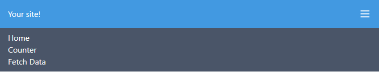
Not too shabby!
Make the links appear or disappear on click#
Before we go any further let’s make those links only appear when you click the icon.
First we’ll add a little C# code to NavMenu.razor.
@code{    private bool _menuVisible = false;
    private void ToggleMenu()    {        _menuVisible = !_menuVisible;    }}
With this we can toggle a boolean _menuVisible on and off.
Now to use that in the markup.
<div class="bg-blue-500 text-white">
    <div class="flex items-center justify-between p-4">        <h1>Your site!</h1>
        <button @onclick="ToggleMenu">            <svg class="h-6 w-6 fill-current" viewBox="0 0 24 24">                <path fill-rule="evenodd"                      d="M4 5h16a1 1 0 0 1 0 2H4a1 1 0 1 1 0-2zm0 6h16a1 1 0 0 1 0 2H4a1 1 0 0 1 0-2zm0 6h16a1 1 0 0 1 0 2H4a1 1 0 0 1 0-2z"/>            </svg>        </button>    </div>
    @{        var menuVisibleClass = _menuVisible ? "" : "hidden";    }
    <ul class="@($"flex flex-col {menuVisibleClass} bg-gray-700 px-4 py-2")">        <NavLink class="" href="/">Home</NavLink>        <NavLink class="" href="/counter">Counter</NavLink>        <NavLink class="" href="/fetchdata">Fetch Data</NavLink>    </ul>
</div>
I’ve added an onclick event handler to the button. When it’s clicked ToggleMenu will be invoked.
The second part may look slightly over-complicated, but with good reason!
Rather than use a conditional @if to control visiblity of the menu I’ve opted to use CSS classes instead.
This is so we can override the class on larger screens (to permanently show the menu).
Here’s how it works:
First I’ve defined a string variable to store the value hidden if _menuVisible is false.
This will be used to hide the menu.
@{ var menuVisibleClass = _menuVisible ? "" : "hidden";}I’ve then used a little string interpolation to include that class in the CSS class definition for our ul.
$"flex flex-col {menuVisibleClass} bg-gray-700 px-4 py-2"NOTE
To use C# when declaring values for an HTML attribute in Razor you can wrap the entire thing in brackets preceded by an @ symbol.
class="@( $"border {blue}" )"This makes it possible to declare C# in the value; In this example rendering the current value of blue as part of the CSS class attribute value.
Handle non-mobile#
With that we’re almost done!
Now to make those links appear automatically (and the icon disappear) on larger screens.
We could just duplicate the ul and have a different one for larger resolutions, but this duplication is bound to catch us out when we come to add more links to the nav.
Instead, we can use some CSS trickery to re-use the exact same ul.
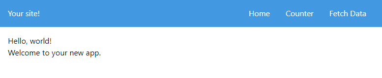
We’re aiming for the nav links to look like this on ‘medium’ and above resolutions.
Here’s how to break this down.
First, if we use flex for the outer div we can make the existing div (which includes the heading and hamburger icon) appear side-by-side with our ul nav links (on medium or higher screen resolutions).
<div class="bg-blue-500 text-white md:flex md:justify-between md:items-center"> <!-- existing content --></div>But this looks a little, er, broken…

- The links are still hidden
- The hamburger icon is squashed up to the heading
The good news is, everything still looks right on mobile, but on larger resolutions we’re not quite there yet.
We don’t actually need to see the hamburger icon at this resolution so we can hide that with a simple md:hidden.
<button @onclick="ToggleMenu" class="md:hidden"> <!-- button svg --></button>We can also make our ul visible with a couple of flex classes.
<ul class="@($"flex flex-col {menuVisibleClass} bg-gray-700 px-4 py-2 md:flex md:flex-row")"> <!-- links --></ul>md:flex md:flex-row take care of making our links visible and displayed horizontally in a row.

Almost there! Now to make the ul background colour disappear on medium screens and above.
md:bg-transparent should do it.
<ul class="@($"flex flex-col {menuVisibleClass} bg-gray-700 px-4 py-2 md:flex md:flex-row md:bg-transparent")"> <!-- links --></ul>That’s a wrap!#
There it is! We have a fully responsive nav bar with a teeny tiny bit of C# to make everything tick.
flex carries a bit of a learning curve, but Tailwind makes it easier to pick up and use.
Once you get the basics (mainly whether to use flex-row or flex-col and justifying items) there’ll be no stopping you!
The ability to target common device resolutions using the breakpoint name as a prefix (md: in the examples above) makes it straightforward to employ different styles at different breakpoints.
Blazor has a small, but very useful role, to handle the click events for the ‘hamburger’ icon, translating that into a simple boolean to determine whether the menu should be visible or not (on smaller screens).
Here’s the final code:
<div class="bg-blue-500 text-white md:flex md:justify-between md:items-center">
    <div class="flex items-center justify-between p-4">        <h1>Your site!</h1>
        <button @onclick="ToggleMenu" class="md:hidden">            <svg class="h-6 w-6 fill-current" viewBox="0 0 24 24">                <path fill-rule="evenodd"                      d="M4 5h16a1 1 0 0 1 0 2H4a1 1 0 1 1 0-2zm0 6h16a1 1 0 0 1 0 2H4a1 1 0 0 1 0-2zm0 6h16a1 1 0 0 1 0 2H4a1 1 0 0 1 0-2z"/>            </svg>        </button>    </div>
    @{        var menuVisibleClass = _menuVisible ? "" : "hidden";    }
    <ul class="@($"flex flex-col {menuVisibleClass} bg-gray-700 px-4 py-2 md:flex md:flex-row md:bg-transparent")">        <NavLink class="md:pl-2 md:pr-4" href="/">Home</NavLink>        <NavLink class="md:px-4" href="/counter">Counter</NavLink>        <NavLink class="md:px-4" href="/fetchdata">Fetch Data</NavLink>    </ul>
</div>
@code{    private bool _menuVisible = false;
    private void ToggleMenu()    {        _menuVisible = !_menuVisible;    }}
Next Steps#
There are of course many more tweaks we could make from here. Here are a couple of ideas:
- Make the links change appearance when you hover over them using Tailwind’s
hover:pseudo class prefix - Use a second icon for when the nav links are visible on mobile, maybe an x to hide them again
Your skills aren't becoming obsolete. They're becoming essential.
Practical engineering principles for building software that works - with or without AI.