Pimp up your Blazor EditForms with Tailwind CSS!
Blazor’s EditForms are super useful, and I wouldn’t choose to tackle things like model validation in Blazor without them.
But, by design, your vanilla EditForms are bland affairs, simply rendering HTML inputs without style.
Here’s how to rectify that, quickly, with Tailwind CSS.
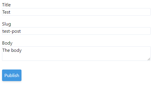
<EditForm Model="Command" OnValidSubmit="HandleValidSubmit"> <label for="title">Title</label> <InputText id="title" @bind-Value="Command.Title" /> <label for="slug">Slug</label> <InputText id="slug" @bind-Value="Command.Slug" /> <InputTextArea @bind-Value="Command.Body" /> <button type="submit">Publish</button></EditForm>Here’s a bog standard EditForm.
And here’s how it looks in a site with Tailwind CSS configured…
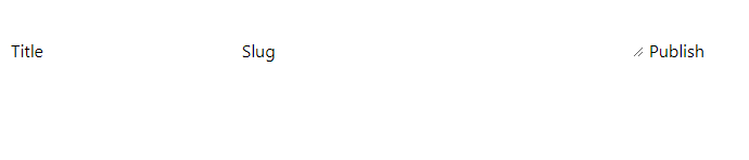
Um, where’s the form?#
Tailwind CSS isn’t Bootstrap.
Where Bootstrap will give you a site which immediately looks like every other Bootstrap site you’ve ever seen, with default styles and decisions made for you, Tailwind CSS takes a different approach.
You get a very minimal set of styles to start with (mainly just to set the defaults for how text appears) then it gets out of your way so you can bend the UI to your will!
This is a little jarring, especially when faced with an almost blank page like this, so where should you start?
Well first up I’d probably try to get these inputs to show up with a border, and move them onto separate ‘lines’ by arranging them in div elements.
I’d also add some margins for good measure, using mb which sets a bottom margin in Tailwind.
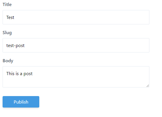
<EditForm Model="Command" OnValidSubmit="HandleValidSubmit"> <div class="mb-4"> <label for="title">Title</label> <InputText id="title" @bind-Value="Command.Title" class="border"/> </div> <div class="mb-4"> <label for="slug">Slug</label> <InputText id="slug" @bind-Value="Command.Slug" class="border"/> </div> <div class="mb-6"> <InputTextArea @bind-Value="Command.Body" class="border"/> </div> <div> <button type="submit">Publish</button> </div></EditForm>Which renders:
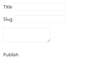
OK that’s beginning to take shape; now I’d work on that button.
One of the things I really like about using Tailwind is how quickly you can iterate towards something which looks decent, even if you (like me) wouldn’t consider design, and CSS, to be your strong suits.
After a bit of experimenting with the button I got to this…
<button type="submit" class="bg-blue-500 text-white rounded shadow-md p-2"> Publish</button>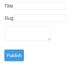
Not too shabby!
NOTE
Stylish hovers?
Our button is currently lacking any style for when the user hovers over it.
It might seem trivial, but actually making the button react when the user interacts with it is crucial to a good user experience.
With Tailwind you can easily tackle these styles by prefixing your css classes with pseudo classes…
<button type="submit" class="bg-blue-500 hover:bg-blue-700 text-white rounded shadow-md p-2"> Publish</button>Note the hover:bg-blue-700 class in there?
When the user moves their cursor over our button it will react by turning a slightly deeper shade of blue, thereby providing a subtle nudge that this is indeed a clickable button.
Set those widths#
Now our form is taking shape but we probably want to standardise the widths of our inputs.
We can make the inputs fill the width of their containing element, using w-full.
<InputText id="title" @bind-Value="Command.Title" class="border w-full"/>Adding this to all the inputs gives us a much better looking form, except we have a new problem; full in this case really does mean full!
This starts to look a little odd on anything bigger than a phone screen.
Aside: I also added a label to the Body input in this last iteration as it looked a little odd sitting there by itself with no label!
The easiest way to bring those widths under control is to set a max width on the parent element, in this case our EditForm element.
Here’s where we’re up to…
<EditForm Model="Command" OnValidSubmit="HandleValidSubmit" class="max-w-lg"> <div class="mb-4"> <label for="title">Title</label> <InputText id="title" @bind-Value="Command.Title" class="border w-full"/> </div> <div class="mb-4"> <label for="slug">Slug</label> <InputText id="slug" @bind-Value="Command.Slug" class="border w-full"/> </div> <div class="mb-6"> <label for="slug">Body</label> <InputTextArea @bind-Value="Command.Body" class="border w-full"/> </div> <div> <button type="submit" class="bg-blue-500 hover:bg-blue-700 text-white rounded shadow-md p-2"> Publish </button> </div></EditForm>NOTE
Responsive Design?
Sometimes you’ll need to adjust how your form appears on different sized screens.
This is pretty straightforward with Tailwind; you can conditionally apply different styles at different breakpoints using the breakpoint name as a prefix.
Here’s how you’d make a div display at different widths.
<div class="w-16 md:w-32 lg:w-48"> Content here</div>The div will default to a width of 16, change to 32 on medium screens and 48 on large.
Incidentally, the TailwindCSS site details what the various w- sizes represent.
Now we just need a few more tweaks to wrap this up.
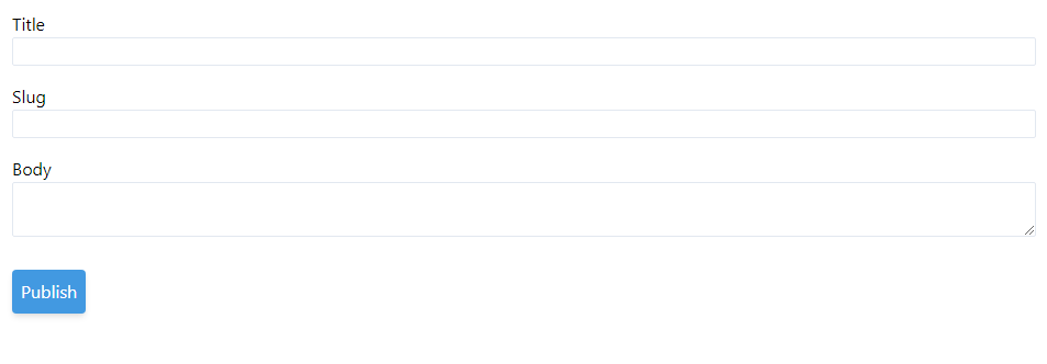
When we start actually interacting with the form it’s clear we’re missing some padding for each input.
We could also do with some space between the labels and the inputs.
Let’s tackle both:
<EditForm Model="Command" OnValidSubmit="HandleValidSubmit" class="max-w-lg"> <div class="mb-4"> <label for="title" class="mb-2 block font-semibold text-gray-700">Title</label> <InputText id="title" @bind-Value="Command.Title" class="border w-full p-3"/> </div> <div class="mb-4"> <label for="slug" class="mb-2 block font-semibold text-gray-700">Slug</label> <InputText id="slug" @bind-Value="Command.Slug" class="border w-full p-3"/> </div> <div class="mb-6"> <label for="slug" class="mb-2 block font-semibold text-gray-700">Body</label> <InputTextArea @bind-Value="Command.Body" class="border w-full p-3"/> </div> <div class=""> <button type="submit" class="bg-blue-500 hover:bg-blue-700 text-white rounded shadow-md p-2"> Publish </button> </div></EditForm>I’ve made a few small tweaks:
- Added some style to the labels (including a bottom margin and setting them to display as
blockelements) - Added padding to the
InputTextandInputTextAreaelements
And here’s how it looks in the browser.
I’d say that’s a passable first attempt at our form!
The elephant in the room?#
Ok ok I know what you’re thinking.
That’s great, I can see how quick it is to iterate and get something which works well on-screen, but are we supposed to just ignore all those repeated classes?
If we take a look at our form with an eye for repeated styles, it’s pretty clear we have a few elements which are always the same whenever we use them.
Namely label, InputText, and arguably InputTextArea and button (if we go on to use these same elements again); chances are we want these to appear consistent every time we use them.
So what should we do?
Well, the shift in thinking from say something like Razor Pages or MVC to Blazor, is that now we need to think in terms of components.
We can very easily create re-usable building blocks for our applications, style them up, then use them throughout our application.
To prove the point, let’s have a go with the label element.
If we create a new InputLabel.razor file we can copy the markup from on of our labels into it…
InputLabel.razor
<label for="title" class="mb-2 block font-semibold text-gray-700">Title</label>Now to make this re-usable we need to figure out which parts of this will change by usage (vary every time we use it).
It seems pretty clear that the for attribute value and contents of the label itself will change, but everything else should remain the same.
To that end we now have two options.
Option A: Explicit parameters#
Probably the simplest option (especially for a first pass at making this work) would be to create a couple of Parameters to use in place of the currently hardcoded values.
InputLabel.razor
<label for="@For" class="mb-2 block font-semibold text-gray-700">@Text</label>
@code{    [Parameter]    public string For { get; set; }
    [Parameter]    public string Text { get; set; }}
Now we can swap out all the labels in our EditForm like so:
<div class="mb-4"> <InputLabel For="title" Text="Title"/> <InputText id="title" @bind-Value="Command.Title" class="border w-full p-3"/></div>Option B: Use ChildContent#
Option A works but it makes our InputLabel work slightly differently to the regular label element.
With ours, you have to provide the label via the Text parameter, but with a real label you put the value of the label inside the element’s HTML selectors.
Our InputLabel example
<InputLabel For="title" Text="Title"/>HTML label
<label for="title">Title</label>It might be nice to match the way labels usually work, not least because this would make it easier to drop an InputLabel in as a direct replacement for a regular label.
We can make this work using a ChildContent Render Fragment.
InputLabel.razor
<label for="@For" class="mb-2 block font-semibold text-gray-700">    @ChildContent</label>
@code{    [Parameter]    public string For { get; set; }
    [Parameter]    public RenderFragment ChildContent { get; set; }}
Here’s how we can use this version…
<InputLabel for="title">Title</InputLabel>Whichever of these two options you go for, the big benefit now is you can head over to InputLabel.razor whenever you want to adjust your label styles; any changes there will ripple through every form where you’ve used the InputLabel component.
From here we can go on to do exactly the same for InputText, InputArea, button and any other elements we want to re-use (with consistent styles) throughout our application.
Iterate and refactor to components#
So next time you’re faced with styling an EditForm, consider using Tailwind CSS.
Start by rapidly iterating to a design you’re happy with, using Tailwind to style individual elements.
Once you’re happy with how it looks, consider refactoring the individual, repeated form elements into their own components. Now you have consistent UX ‘building blocks’ which you can use for any form in your application.
Your skills aren't becoming obsolete. They're becoming essential.
Practical engineering principles for building software that works - with or without AI.