Quickly transform any mockup or design into a working Blazor prototype
When you start building a web application it’s often hard to know where to begin.
Right at the beginning, before you’ve built anything, you face that “blank piece of paper moment”.
That moment where you…
- don’t know what technical challenges you’re going to face
- don’t have any momentum to build on
… and getting the project going from this point feels like an uphill struggle.
But, things get an awful lot easier when you find a way “in”, a way to take this seemingly gargantuam task and break it down into smaller ones.
To this end, modern frameworks (think React, Angular and yes, Blazor) favour a “component based” approach to application building.
The component-driven approach:
- Break your complex UI down into smaller components
- Build each component, one at a time
- Compose those components together to form your UI
Break it down into smaller components#
Let’s say you’re faced with a mockup, or design, and you need to build it using Blazor; where do you begin?
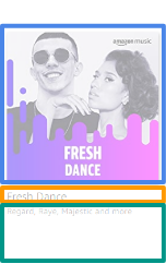
We’ll take a real application by way of example; Amazon Music.
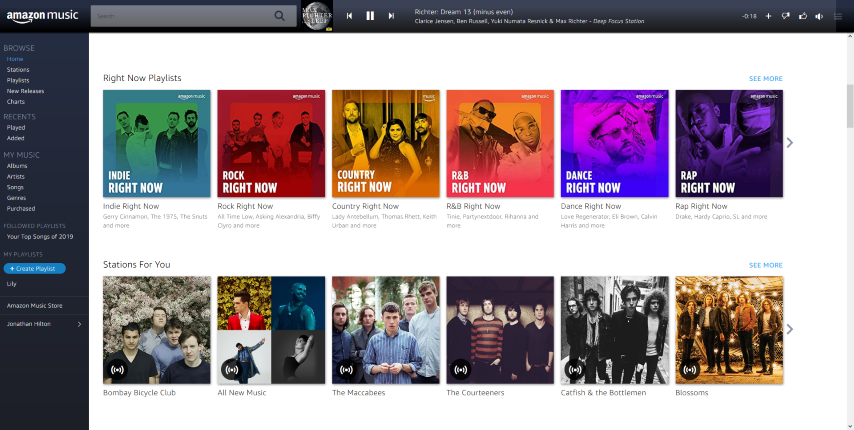
If I were tasked with building a UI like this (after I’d questioned why we’re copying Amazon Music!) I’d have a stab at identifying the different “parts” of the UI…
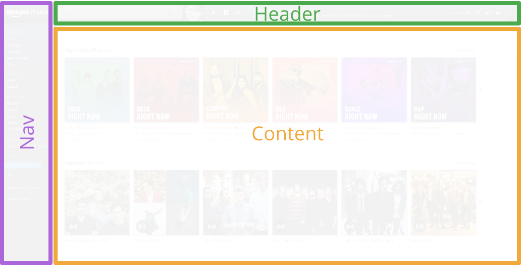
First we have the high level elements that make up the UI, namely the components that define the overall layout.
Then, diving in to the main content section…
One of the interesting side effects of “thinking in components” is that you’re forced to name important concepts/parts of the UI.
In this case I have no idea what Amazon actually call these things, but it seems the home page is essentially made up of lots of these “collections” which scroll horizontally and group things like “Featured Artists”, “Recently Played” etc.
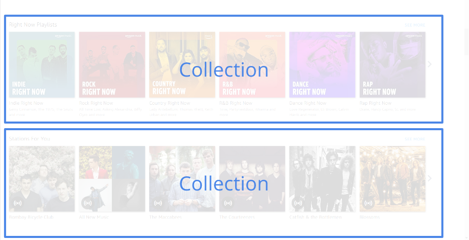
Looking into the collections themselves we find more components…
Here we have:
- Collection Title
- Link to see more
- Nav arrows to scroll left and right
- Card which shows the image and title of the album/playlist/song
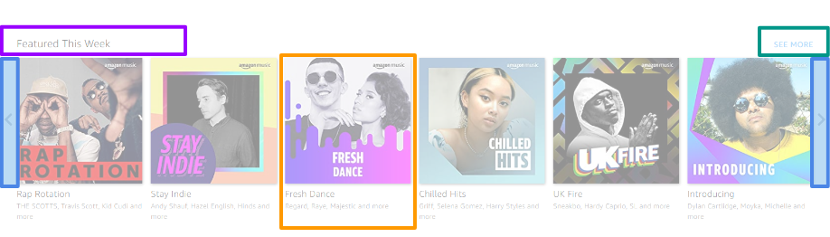
And yep, you guessed it, it’s components all the way down, now we have the card itself…
Which comprises an image, title (including link) and description.
From here we could go back to the other components (nav and sidebar) and do the same exercise, breaking each part of the UI down until we get to the lowest level components.
Components or just regular HTML tags?#
There’s always a degree of subjectivity around what warrants being its own component when you start breaking an application down like this.
For example, you might decide to use standard HTML tags for things like titles and descriptions (h1, p, etc.)
But sometimes even these elements will have behaviour which you want to be consistent throughout your application, in which case it makes sense to turn them into re-usable components.
Crucially though, we now have a starting point for actually building our application.
Build your application, one component at a time#
“Recreate the UI for Amazon Music” has turned into a much more managable task.
We’ve taken a complex app and identified much smaller pieces that we can build, one at a time.
As you embark on this process the aim is to create an initial version of each component, iterating until you have something you’re happy with.
Here are a few tips to help you keep yourself on track…
Decide whether to build top-down or bottom-up#
You can choose whether to to build from the top down (high level layout components first, then “fill in” the detail as you work down each section) or build the lower level components and compose them together later.
I tend to favour the first approach, so I might start with some basic version of the layout first, something like this…
home.razor
@page "/"
<div class="w-screen h-screen grid grid-cols-site grid-rows-site">    <header class="col-span-2 p-8 border">        Header    </header>    <nav class="bg-gray-600 p-8 border text-white">        Nav    </nav>    <section class="p-8 border">       Content    </section></div>
I’m using Tailwind CSS here, to give this just enough structure to approximate Amazon Music’s layout…
To that end, I’ve defined a couple of custom grid styles to make this hang together:
tailwind.config.js
gridTemplateColumns: { 'site': '150px 1fr'},gridTemplateRows: { 'site': '100px 1fr'},Here’s how it comes out…
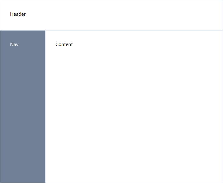
Not too shabby!
Now I’m free to work my way down the component tree, building the collection then card components.
Start with hardcoded data#
One trap to avoid when building any web application is trying to wrestle all the moving parts into submission from the get go.
It’s tempting to do the UI, network calls, API endpoints etc all in one go.
But, there’s something to be said for being able to play with the UI first, free from concerns about hooking it up to actual data.
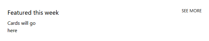
To facilitate this I tend to start with hardcoded text first…
Collection.razor
@using Microsoft.AspNetCore.Components
<section class="w-auto p-6">    <h1 class="flex justify-between text-xl mb-2">        Featured Albums        <a href="#" class="text-base uppercase">See More</a>    </h1>    <section class="grid gap-3 grid-cols-6">        Cards will go here    </section></section>
This renders the heading and link to see more, plus a section to contain our cards representing albums, playlists etc.
You can go a long way with hardcoded data (probably further than you think), but sooner or later you will need to consider how you’re going to fetch your data and display it in your components.
Consider where to fetch your data#
There are a number of ways to get data into your components but two key strategies emerge as the simplest options.
You can retrieve data at a high level, and pass it down the component tree via parameters.
So in our case the Home component might fetch all the various collections and render several instances of our Collection component, passing the details into each one.
Alternative you can have each component fetch its own data.
So each instance of Collection might just take a CollectionId parameter then fetch the relevant collection details itself.
Either option is valid, and largely comes down to considerations like how much data you want to load in one go, how many network calls you want to make to your backend (lots of little calls or fewer larger calls).
Parameterise your components#
Once you have an idea about where the data’s coming from for your component, you can introduce parameters for the “dynamic” elements.
With our collection component for example, we’ll want to pass in the title, and destination for the “See More” link (I’m not thinking about cards just yet).
@using Microsoft.AspNetCore.Components
<section class="w-auto p-6">    <h1 class="flex justify-between text-xl mb-2">        @Title        <a href="@SeeMoreLink" class="text-base uppercase">See More</a>    </h1>    <section class="grid gap-3 grid-cols-6">        Cards will go here    </section></section>
@code{    [Parameter]    public string Title { get; set; } = "Featured this week";
    [Parameter]    public string SeeMoreLink { get; set; } = "/some-more-songs";}
This works for primitives (strings in this case) but also for objects.
Let’s say we want to pass a list of items into our collection component (so it can render “cards” for each one).
Collection.razor
@code{    [Parameter]    public string Title { get; set; } = "Featured this week";
    [Parameter]    public string SeeMoreLink { get; set; } = "/some-more-songs";
    [Parameter]    public IEnumerable<CollectionItem> Items { get; set; }
    public class CollectionItem    {        public string Title { get; set; }        public string Description { get; set; }        public string ImageUrl { get; set; }    }}
We can then loop over this enumerable to render each card.
@using Microsoft.AspNetCore.Components@using System.Collections.Generic
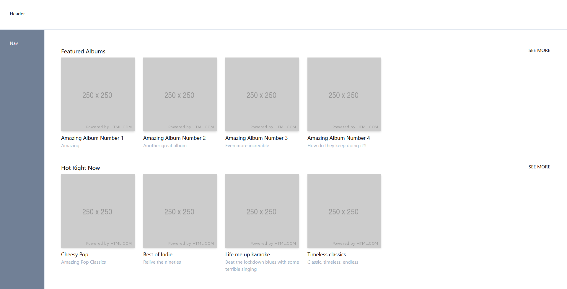
<section class="w-auto p-6"> <h1 class="flex justify-between text-xl mb-2"> @Title <a href="@SeeMoreLink" class="text-base uppercase">See More</a> </h1> <section class="grid gap-3 grid-cols-1 md:grid-cols-3 lg:grid-cols-6"> @foreach (var item in Items) { <Card Title="@item.Title" Description="@item.Description" ImageUrl="@item.ImageUrl"/> } </section></section>Speaking of “cards”, let’s tackle those now.
To keep things simple we’ll skip the whole scrolling left/right thing for the time being.
Card.razor
@using Microsoft.AspNetCore.Components
<div class="mr-2">    <img class="object-cover shadow-md" src="@ImageUrl"/>    <div class="mt-2">        <h1 class="text-lg">@Title</h1>        <p class="text-base text-gray-500">@Description</p>    </div></div>
@code{    [Parameter]    public string Title { get; set; }
    [Parameter]    public string Description { get; set; }
    [Parameter]    public string ImageUrl { get; set; }}
Putting this all together we end up with something that looks like this…
From here, there’s more work to be done, like making the cards scrollable, making sure this is responsive for different screen sizes (Tailwind CSS makes this a doddle) and a few other key improvements.
But, overall we’ve made good inroads and quickly built a good first prototype of our Amazon music clone!
In Summary#
When faced with a complex UI design or mockup, break it down and build it as a series of components.
- Identify the key components (highlight them on the mockup/design)
- Build each component as simply as possible (keeping each one small and focused)
- Iterate quickly, use hardcoded data to get something on screen
- Sustain momentum by employing the best data fetching strategy for each component (or set of components)
Check out the complete source code if you want to dig into this further.
Your skills aren't becoming obsolete. They're becoming essential.
Practical engineering principles for building software that works - with or without AI.