Dark mode for your web applications (using Blazor and Tailwind CSS)
Eyestrain is a real problem, especially for those of us who spend most of our time staring at our monitors.
Dark mode offers a handy solution. By opting for a dark color scheme in the applications we use every day we can massively reduce the effects of prolonged monitor usage and keep that eyestrain in check.
So how can we enable this in our Blazor applications? Well it turns out this is relatively straightforward if we use TailwindCSS and Blazor in perfect harmony.
Use an up-to-date version of Tailwind CSS#
First you’ll need to make sure you’re using an up-to-date version of Tailwind CSS (which has dark mode support).
NOTE
Add Tailwind CSS to your Blazor app
Chris Sainty has an excellent blog post which demonstrates how to add Tailwind to your Blazor app. Just make sure you select the latest version when you set this up and you’ll be good to go.
Tailwind now makes it straightforward to specify dark mode styles for your app using the dark variant.
<div class="bg-white text-gray-700 dark:bg-gray-700 dark:text-gray-50"> Hello World</div>With these styles the div would either have a white background with dark gray text or, in dark mode, a dark gray background with off-white text.
Tailwind offers a couple of ways to toggle dark mode on and off.
You can choose to always respect the settings at OS level, or control dark mode via a CSS class.
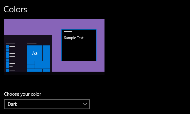
So for example, in Windows you can use System Settings > Colors and choose Dark for your apps…

TailwindCSS can then rely on this setting to determine whether to use dark mode or regular CSS styles.
However, it can also be useful to give your users a bit more control over this (to toggle between dark and light modes manually).
So for that to work we can tell TailwindCSS to toggle dark mode via a CSS class.
The relevant setting can be found in tailwind.config.js:
darkMode: 'class', // 'media' or 'class'With this set to class we just have to add the dark class somewhere in our app and anything below it will respect our dark variant styles.
<div class="dark">    <p class="text-gray-700 dark:text-white">        This will respect the `dark` variant styles    </p></div>
<div>    <p class="text-gray-700 dark:text-white">        This will ignore the `dark` variant styles    </p></div>
In practice you’d probably want to toggle the dark class very high up in your application’s component tree, so the entire site switches in and out of dark mode.
Designing for dark mode#
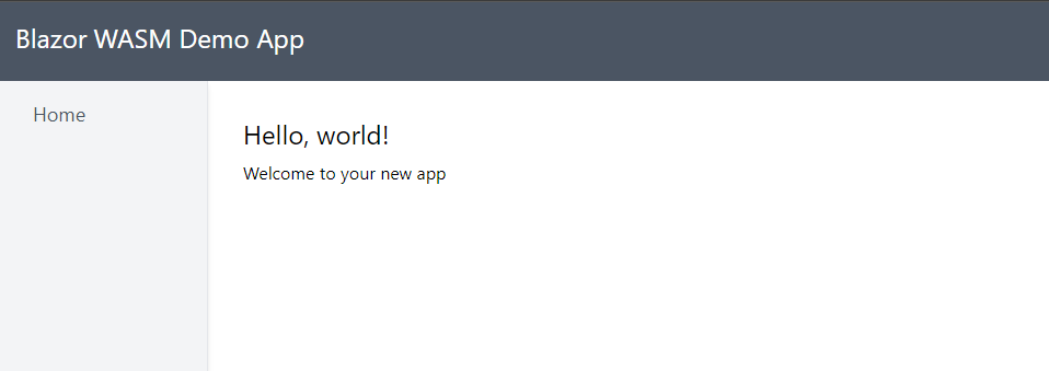
Here’s a minimal example of a layout which supports both ‘dark’ and ‘light’ mode with a little help from Tailwind CSS…
MainLayout.razor
<div class="flex flex-col h-screen">
    <div class="bg-gray-600 p-4 flex justify-between">        <h1 class="text-white">Blazor WASM Demo App</h1>    </div>
    <div class="flex-grow flex dark:bg-gray-700">        <div class="bg-gray-100 px-8 w-48 py-4 border-r shadow-md dark:bg-gray-500">            <NavMenu/>        </div>
        <div class="flex-grow w-auto p-8 mx-auto max-w-5xl">            @Body        </div>    </div>
</div>
This is a fairly standard layout with two columns and a header, defined using flex.

There are a couple of usages of the dark variant and we can check how these look if we manually add the dark class to the outer div in MainLayout.razor.
<div class="flex flex-col h-screen dark"> <!-- other code --></div>
Default styles#
Incidentally you can set default styles for elements in your TailwindCSS app…
Here are the styles I’m using for this demo; notice how things like the headings and paragraphs have both ‘normal’ and ‘dark’ variant styles defined.
@tailwind base;@tailwind components;@tailwind utilities;
a {    @apply text-blue-600;}
p {    @apply my-2 dark:text-gray-50;}
h1 {    @apply text-2xl mb-2 dark:text-gray-50;}
h2 {    @apply text-xl mb-2 dark:text-gray-50;}
h3 {    @apply text-lg mb-2 dark:text-gray-50;}
button {    @apply p-2 rounded-md shadow-md bg-blue-500 dark:bg-gray-200 text-white dark:text-gray-600;}
Toggle Dark Mode using Blazor#
Now we know we can switch between light and dark manually we just need a way to do that using Blazor…
First we’ll need a way to flip between them; for this we can create a new component…
ThemeToggle.razor
<button @onclick="Toggle">Toggle</button>
@code {
    private bool _darkMode = false;
    [Parameter]    public EventCallback<bool> OnDarkModeToggled { get; set; }
    private void Toggle()    {        _darkMode = !_darkMode;        OnDarkModeToggled.InvokeAsync(_darkMode);    }}
This component maintains its own state for whether dark mode is toggled or not, and communicates that state via an EventCallback.
We can now use this component in MainLayout.razor.
@inherits LayoutComponentBase
<div class="flex flex-col h-screen @(_darkMode ? "dark" : "")">
    <div class="bg-gray-600 p-4 flex justify-between">        <h1 class="text-white">Blazor WASM Demo App</h1>        <ThemeToggle OnDarkModeToggled="@HandleDarkModeToggled"/>    </div>
    <div class="flex-grow flex dark:bg-gray-700">        <div class="bg-gray-100 px-8 w-48 py-4 border-r shadow-md dark:bg-gray-500">            <NavMenu/>        </div>
        <div class="flex-grow w-auto p-8 mx-auto max-w-5xl">            @Body        </div>    </div>
</div>
@code{    private bool _darkMode = false;
    private void HandleDarkModeToggled(bool isDarkMode)    {        _darkMode = isDarkMode;    }}
There are a few things going on here.
We’ve declared an instance of our ThemeToggle component and assigned a handler to its OnDarkModeToggled EventCallback Parameter.
HandleDarkModeToggled sets a bool to keep track of whether we’re in dark mode or not.
Our markup then uses this _dark bool to conditionally apply the dark class to the outer div.
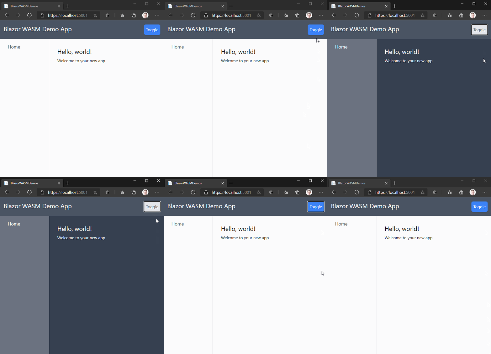
And that’s it! Now if we click the button to toggle between the modes we’ll flip seamlessly between light and dark mode.

What next?#
So far so good, we’ve seen how to manually toggle different styles for dark mode using Blazor to toggle a dark class in our markup.
However we don’t really want to force our users to toggle dark mode manually every time they use our site, and it would be good to respect their OS preferences as well.
The next post will address both of these requirements.
Your skills aren't becoming obsolete. They're becoming essential.
Practical engineering principles for building software that works - with or without AI.