Don't rush to build that re-usable Blazor component
You know how it goes.
A product owner/manager/other stakeholder asks for a page with a table showing a few hundred rows…
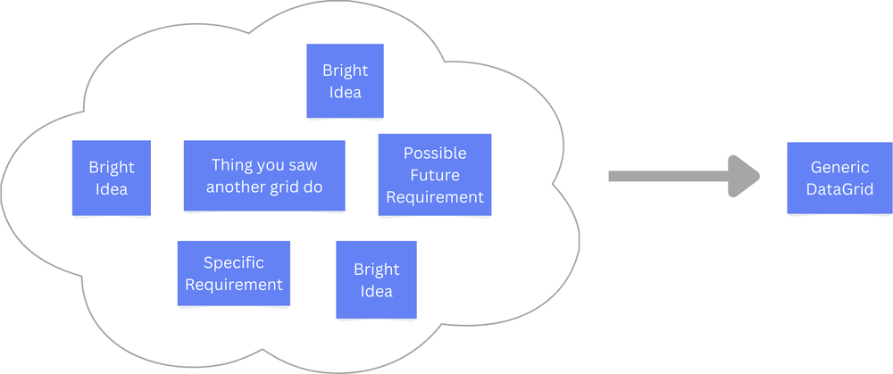
Next thing you know you’re building a multi-purpose, generic, customisable DataGrid that can scale to thousands of rows, sort and filter data.
If this sounds familiar then you’ve probably fallen into a common trap in programming, the abstraction leap.
It’s where you’re given a specific requirement, and your engineer brain thinks…
“Ah, we’re probably going to need lots of these, I’ll create something generic”.
Here’s the rub.
When you start building something generic, and massively re-usable, it’s all too easy to start guessing at the requirements.
You’ve got the concrete thing you were asked to build (a simple page with a few rows of data).
But now your brain has given this a name - It’s a DataGrid.
And if you’re building a DataGrid you’d better build all the things a DataGrid ought to have.
You start subconsciously comparing your not yet built DataGrid to all the other DataGrids out there.
At this point you’ve given your brain a problem, and oh how brains love a good juicy problem.
The scope, at this point, is effectively unbounded, infinite.

Several days later the PO comes back to ask how you’re getting on and, sheepishly, you explain that you just need to finish the functionality to dynamically add new rows when a button’s clicked…
So what’s the answer?
The key is to remain rooted in the concrete.
Abstractions are important, and a big part of what makes software easier to extend and maintain.
But every skyscraper is built on concrete foundations.

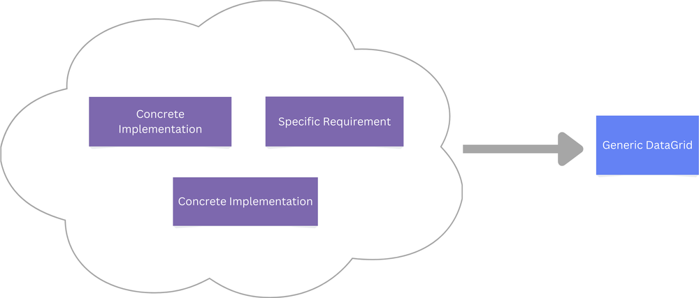
It’s much easier to design and build an abstraction when you have a couple of concrete types to use as a guide.
Here’s the process I use to stay grounded when building Blazor components.
- Build a super-specific component for the first requirement
- Model only what’s actually needed (based on the mockup/design/requirement)
- If a similar requirement comes in, build another specific component
- With the two concrete implementations, see if an obvious abstraction stands out
- Check the abstraction actually applies to both implementations
- Refactor the concrete implementations to use a shared component
Start Specific#
It’s way easier to build the concrete implementation first.
Take a simple enough requirement, to show a product card in a list of products.
The danger is you’ll think card and immediately run off to build a generic card component.
If so, you’ve just leapt to an abstraction.
I try to fight that instinct by starting with a specific card. In this case, specifically for showing product info.
ProductCard.razor
<div class="card">    <img class="card-img-top" src="/images/@Product.Image" alt="Product Image Description"/>
    <div class="card-body">        <h5 class="card-title">@Product.Title</h5>        <p class="card-text">@Product.Price.ToString("C")</p>    </div>
    <div class="card-footer">        <p class="text-center">FREE Delivery</p>    </div></div>
@code {    [Parameter]    public ProductSummary Product { get; set; }}
It’s fairly easy to build this because we’re rooted in specifics.
We can look at the mockup/design/text requirement, and build something that closely resembles it (without spending extra compute cycles thinking about how to support possible future requirements).
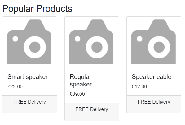
Here’s how it ends up looking in the browser:

Now let’s say a requirement comes in to build a screen for the admin section of the site that allows customer service operators to track the progress of support tickets on a Kanban board.
The kanban board needs to show (you guessed it) a card for each customer support request.
Now, if we had an existing component kicking around we might be tempted to re-use it.
We don’t, so we can focus on the Kanban board specifics, and see how this card turns out.
SupportCard.razor
<div class="card mb-2 shadow-sm">    <div class="card-header d-flex justify-content-end">        <span class="rounded-md p-2 department">@SupportTicket.Department</span>    </div>
    <div class="card-body">        <p class="card-text">@SupportTicket.Subject</p>    </div>
    <div class="card-footer py-3">        <button class="btn btn-primary" @onclick="Resolve">Resolve</button>    </div></div>
@code {    [Parameter]    public SupportTicketSummary SupportTicket { get; set; }
    private void Resolve()    {        // in reality - call an API or something        Console.WriteLine("Ticket resolved");    }}
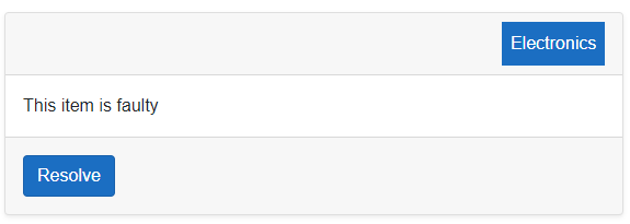
When we view this in the browser we’ll see this simple card:

Is there a common abstraction?#
Now we’ve two implementations of some sort of card the question is, given the concrete examples we’ve ended up with, do they share any DNA.
Is there any value in pulling out a common component that could be used in both cases?
Seeing how we’ve used Bootstrap’s card classes, and given how similar these two look when we view them in the browser, it looks like there may be value in extracting a common card component.
But I’d still take a moment to challenge that assumption.
Are they actually the same?
Are there any fundamental differences that would lead to conditional logic in the new shared component (conditional logic is a clue that they may not be the same after all).
At this point you can always wait for a third example :) But let’s assume we want to try creating a common card component.
The job now is to create the common “base” card type, that both of the existing implementations can delegate to for common card UI and functionality.
Here’s how that might look:
<div class="card mb-2 shadow-sm">    <div class="card-header">        @Header    </div>    <div class="card-body">        @ChildContent    </div>    <div class="card-footer py-3">        @Footer    </div></div>
@code {    [Parameter]    public RenderFragment Header { get; set; }
    [Parameter]    public RenderFragment ChildContent { get; set; }
    [Parameter]    public RenderFragment Footer { get; set; }}
Notice how this base card component is quite minimal. We want to let the business specific cards continue to handle their specific logic.
With this we can update SupportCard.razor to defer to the new Card component:
<Card> <Header> <div class="d-flex justify-content-end"> <span class="rounded-md p-2 department">@SupportTicket.Department</span> </div> </Header> <ChildContent> <p class="card-text">@SupportTicket.Subject</p> </ChildContent> <Footer> <button class="btn btn-primary" @onclick="Resolve">Resolve</button> </Footer></Card>Notice how this retains all the support ticket specific logic and UI.
The same goes for our original product card.
ProductCard.razor
<Card> <Header> <img class="card-img-top" src="/images/@Product.Image" alt="Product Image Description"/> </Header> <ChildContent> <h5 class="card-title">@Product.Title</h5> <p class="card-text">@Product.Price.ToString("C")</p> </ChildContent> <Footer> <p class="text-center">FREE Delivery</p> </Footer></Card>Applying it to your own projects#
When faced with a new requirement, start with concrete implementation. Specific components provides a useful constraint when you build something new for the first time.
Specific requirement -> Specific component.
When you defer the decision to create a shared component you get to focus on what’s actually needed, and get something built quickly that meets the those requirements.
When you have a couple (or more) concrete implementations, you might see a pattern, a clue that a shared component/abstraction is lurking.
But always check the requirements are actually the same.
A re-usable component can make it easier to maintain your application, giving you one place to go to tweak common behaviour.
But, if you shoehorn a re-usable component in where the use cases are actually quite different, that same abstraction will slow you down, and risk causing the rippling change effect (where a “small tweak” breaks large swathes of your UI).
In short, start specific, then refactor when you’ve got something real to build on.
Your skills aren't becoming obsolete. They're becoming essential.
Practical engineering principles for building software that works - with or without AI.