How I organise my Blazor components
When you come to a web project how do you know where to find its components?
After a few years working on Blazor projects I’ve settled on a fairly consistent approach for organising my components.
As ever, your mileage may vary :-)
Features - Components - Feature A - Components - Index.razor - AnotherPage.razor Index.razorFirstly I always rename Pages to Features. It’s not a huge change but subtly reminds me that features are key!
I keep any components that are re-usable across the entire application in the top level Features\Components folder.
The default ‘page’ for the entire site is found at Features\Index.razor.
Heading down into the specific features it’s largely the same approach.
Inside each feature folder is the ‘home page’ for that feature (Feature A\Index.razor). Any components relating to that component go in the Components folder for that feature.
If a feature has multiple pages I’ll just include them as siblings next to Index.razor (as with AnotherPage.razor in this context).
But if a ‘page’ starts to grow, and requires its own components (which aren’t used by anything higher up the tree) I’ll create a new subfolder for that ‘sub’ feature, adhering to the same structure.
Features - Components - Feature A - Components - Index.razor - AnotherPage.razor - Sub Feature - Components - Index.razor Index.razorA Real example#
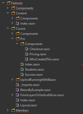
Here’s a partial example from the code for Practical ASP.NET.

For context, the Course folder contains landing pages for different courses/ebooks.
The Pro subfolder exists because the landing page for Practical ASP.NET Pro (an online community) has its own, unique components which only it uses, plus some extra pages, hence the dedicated subfolder.
Benefits#
I find this applies some useful, subtle pressure to decisions about how to break my UI down into components.
It helps to ensure I’m very deliberate about which components are truly re-usable and generic enough to be useful across the entire application (and therefore go in that top level Components folder).
These re-usable components are things like Buttons (which need a consistent look and feel across the entire site), Panels, Modals etc.
Otherwise I’m usually building components which are only used within a certain feature and so those exist close to all the other components/pages which form that feature.
The key constraint is that a page/component can’t use a component from a sibling, or feature ‘below’ it.
Imagine there’s a solid brick wall between the features; they are essentially their own silos. You can pull things in from above, but you can’t punch a hole in the silo wall or bottom!
If a component is truly to be shared between multiple features it needs to be pulled ‘up’ to a higher level folder.
In this example, if a page/component in the Members folder needs to display a Panel, it can either have its own (kept in its own Components folder) or we have to pull that Panel component up higher.
As in this example, if the UI in Courses still needs its own distinct/unique version of Panel, it’s fine to define that in the Course feature’s own Components folder.
But if another feature needs one of our ‘standard panels’ (as defined in the top level Components folder) that’s fine too.
The two Panels may both be called ‘Panel’, but in this case they represent completely different components, with specific functionality/UI in each use case.
NOTE
Don’t rush to make your components “re-usable”.
The minute you have more than one reference to a component you have more places you need to think about/check when making changes. You’re also likely to start adding conditional code to make that component work in different scenarios.
Lines of code increase, as does the component’s complexity and before you know it you end up with “that component”, the one that’s at the heart of everything and which no-one dares touch for fear of breaking everything!
Make your components work hard to prove they’re actually the same concept/feature in your application.
Just because you’ve decided to call them both ‘Panel’ does not mean they represent the same ‘thing’ in your application.
Consistency is key#
Overall, I’ve found this approach makes it easier to consider a feature on its own merits, understand how it’s structured and refactor as necessary.
The key is to be consistent and avoid re-using components for the sake of convenience when actually, in practice, those components represent different ‘things’ in your UI.
Your skills aren't becoming obsolete. They're becoming essential.
Practical engineering principles for building software that works - with or without AI.

