Avoiding interactivity with Blazor?
Last week I was working on a client project when I ran into a requirement to show a checkbox as part of a form.
Pretty straightforward right?
However I hit a bit of a stumbling block when I realised I needed to tweak the appearance of the checkbox (to better match the style of the application).
It turns out there are limits to how far you can tweak the default checkbox using HTML and CSS.
So I turned to the internet to do a little research.
Now there are some really weird and wacky tricks you can use to customise checkboxes, but a common approach is to hide the default checkbox then render your own alternative.
When a user clicks this ‘alternative’ element (be it an image, an icon, or some other HTML element) it will forward that click to the hidden checkbox (so you can toggle it on and off without ever interacting with the checkbox directly).
<input type="checkbox" id="customCheckbox" class="custom-checkbox" /><label class="checkbox-label" for="customCheckbox"></label>In this case the label will act as the proxy for the checkbox.
When you click the label it will toggle the checkbox on and off.
Hide the checkbox, render an image in the label, and you have a clickable image you can use to toggle the checkbox on or off.
.custom-checkbox { display: none;}
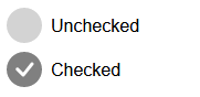
.checkbox-label { display: inline-block; width: 32px; height: 32px; cursor: pointer; background-image: url("data:image/svg+xml,%3Csvg xmlns='http://www.w3.org/2000/svg' width='32' height='32' fill='lightgrey' class='bi bi-circle-fill' viewBox='0 0 16 16'%3E%3Ccircle cx='8' cy='8' r='8'/%3E%3C/svg%3E");}We can take this one step further and display a different image when the checkbox is checked, using CSS selectors…
.custom-checkbox:checked + .checkbox-label { display: inline-block; width: 32px; height: 32px; background-image: url("data:image/svg+xml,%3Csvg xmlns='http://www.w3.org/2000/svg' width='32' height='32' fill='grey' class='bi bi-check-circle-fill' viewBox='0 0 16 16'%3E%3Cpath d='M16 8A8 8 0 1 1 0 8a8 8 0 0 1 16 0m-3.97-3.03a.75.75 0 0 0-1.08.022L7.477 9.417 5.384 7.323a.75.75 0 0 0-1.06 1.06L6.97 11.03a.75.75 0 0 0 1.079-.02l3.992-4.99a.75.75 0 0 0-.01-1.05z'/%3E%3C/svg%3E");}This targets an element with the class .checkbox-label which immediately follows the checkbox, and only when the checkbox is checked.
With this we have a custom checkbox which shows different images for its checked and unchecked states.
Note how this doesn’t require any C# or JavaScript.
Just markup (HTML) and some conditional CSS styles.
How does the Blazor Web App template do it?#
Here’s another example.
In the default Blazor web app template there’s one of those side navigation menus we’re all so familiar with.
In responsive mode (on smaller screens) it shows a ‘hamburger’ icon which, when clicked, toggles the visibility of the sidebar.
But now we have a mystery on our hands. How does it work?
The Blazor Web App template is built to work with static server-side rendering.
With SSR your components aren’t interactive.
They render once on the server, with the resulting HTML then being sent back to the browser.
This means you can’t have interactivity, where you click on an element and have it run code, because there’s nothing running (on the server or client) after that initial render.
If you wanted to use C#/Blazor control the visibility of the sidebar you’d have to run that component using one of Blazor’s interactive modes.
Because the NavBar component is rendered high up in the component tree (in MainLayout) this would effectively mean running your entire app interactively, thereby defeating the point of using SSR in the first place.
So how do they get the sidebar toggle to work?
Turns out it’s another humble checkbox (and some CSS).
First the checkbox…
<input type="checkbox" title="Navigation menu" class="navbar-toggler" />This is styled, using CSS, to replace the default checkbox style with the hamburger menu (SVG).
.navbar-toggler { appearance: none; cursor: pointer; width: 3.5rem; height: 2.5rem; color: white; position: absolute; top: 0.5rem; right: 1rem; border: 1px solid rgba(255, 255, 255, 0.1); background: url("data:image/svg+xml,%3csvg xmlns='http://www.w3.org/2000/svg' viewBox='0 0 30 30'%3e%3cpath stroke='rgba%28255, 255, 255, 0.55%29' stroke-linecap='round' stroke-miterlimit='10' stroke-width='2' d='M4 7h22M4 15h22M4 23h22'/%3e%3c/svg%3e") no-repeat center/1.75rem rgba(255, 255, 255, 0.1);}This takes our earlier example and forgoes the separate label element to replace the checkbox.
Here it’s all done with the original checkbox.
By setting appearance to none this removes the default styling of checkboxes (as applied by the browser).
It then assigns a background image and we get the same result, a custom checkbox.
The sidebar itself is set to be hidden by default, then made visible when the checkbox is checked.
.nav-scrollable {    display: none;}
.navbar-toggler:checked ~ .nav-scrollable {    display: block;}
NOTE
Wondering about that funky looking ~?
That’s the CSS general sibling combinator.
Here it’s used to select the .nav-scrollable element that is a sibling of the checked
.navbar-toggler element.
Avoiding the interactivity tax#
In both these cases we get basic interactivity without using C# or Blazor.
But why not just use one of Blazor’s interactive modes for everything and be done with it?
In this article about Blazor from Service Stack, they refer to Blazor’s “Interactivity Tax”.
There are many benefits to using SSR where you can, for SEO optimisation, fast loading.
Using one of Blazor’s interactive modes adds complexity to your app, with varying trade-offs, be that downloading everything to the browser (client), or keeping socket connections open on the server.
The interactive render modes are excellent and practical options when you need a high degree of interactivity in your app.
But if you don’t, it might just pay to brush up on your HTML and CSS.
With SSR, HTML and some savvy CSS selectors you can go a long way.
But wait, it would be remiss of me not to point out one final thing about that Blazor web app template implementation.
If you toggle the sidebar so it’s open, you probably want it to then close when someone clicks on a link to navigate to a new page.
By default, thanks to Blazor’s enhanced navigation, the new page content will be fetched and loaded without resorting to a full page load.
The result is that sidebar remains stubbornly open, even after you’ve clicked a link (and would really want it to be hidden).
So how does the Blazor team handle that?
Well it turns out there’s just a teeny bit of JavaScript hiding in that NavBar component!
<div class="nav-scrollable" onclick="document.querySelector('.navbar-toggler').click()">This ensures the navbar-toggler checkbox is toggled when someone clicks any element in the navbar (for example, to follow a link).
If all you have is a hammer, everything looks like a nail…
Pragmatism is the real winner here.
CSS and HTML are (still) the fundamental building blocks of the web.
There’s a lot ot be said for Blazor’s static server-side rendering approach.
It’s a fast, convenient way to build apps which don’t require significant interactivity and means you can reap the benefits of using Blazor’s component model to break down complex features into smaller building blocks (without paying Blazor’s interactivity tax).
After that, if you just need a little bit of interactivity, JavaScript remains a pragmatic option for sprinkling small amounts of interactivity here and there.
Then, and especially if your app is highly interactive, Blazor’s interactive modes have your back.