Good (Blazor) Components are...
Components, done “right” carry tremendous potential to speed up your web development, and make ongoing maintenance (and development) of your apps much easier.
But, like any tool, it all depends how you use it.
If you just use Blazor to re-create the kinds of web pages you’ve always built you’re missing out on a lot of this potential.
But that begs the question, what does it take to use components effectively, what makes for a “good” component?
Here are three things I’d aim for:
- Components that are as small as possible (but no smaller)
- Components that can be re-used (when it makes sense to do so)
- A clear separation between “Business logic components” and everything else
As small as possible (but no smaller)#
Components, like classes in C#, are easier to work with when they’re small.
You know this intuitively.
If you head into an app to make a “small change”, open it up and find one giant “page” component, full of conditional logic, loops, fields and methods, you know you’re in for a rough morning.
The answer is to break that large UI down into smaller components.
Smaller components are easier to read, understand, and modify (because they’re generally doing a lot less than your large single page behemoths).
Here’s an example, taken from Practical Blazor Components, of a TargetWord component.
It forms part of a game where players guess what the hidden film title is.
Players have a limited number of guesses. Every time they attempt a letter, another part of the app checks if the letter
is found in the target word, then updates the FoundLetters HashSet.
This TargetWord component displays the target word (as underscores for letters which haven’t been guessed, and the
actual letters if they have).
<div class="targetSentence">
    @foreach (var word in Target.Split(" "))    {        <span class="word">            @foreach (var letter in Letters(word))            {                <span>@letter</span>            }        </span>    }
</div>
@code {
    [Parameter]    public string Target { get; set; }
    [Parameter]    public HashSet<char> FoundLetters { get; set; }
    List<char> Letters(string word)    {        return word            .Select(character => FoundLetters.Contains(character) ? character : ' ')            .ToList();    }
}
This component has no interest in how FoundLetters or the TargetWord is derived, it simply takes what it’s given
and runs with it.
We could have just included this UI and logic in the main component for the game but, well, you can imagine how big and complicated that component would become over time!
Here, if we need to tweak how we’re displaying the target word, we can quickly understand what’s going on and make our changes with a high degree of confidence that we’re unlikely to break anything else.
But, watch you don’t make your components too small.
If you find yourself jumping around between 100 components for one small part of your UI, you may have gone too far!
There’s no absolute size to aim for here, the main thing is to keep your components small enough that you can easily understand what they’re doing, and it’s easy for you to go in and make changes.
Re-usable (when it makes sense)#
Components are geared up for re-usability.
You can use any component as many times as you like.
Under the hood, Blazor will create a tree, containing every instance of your component.
This is where you can see some real productivity gains in Blazor. As you build your app, you get to create more and more building blocks which you can then use to build out the rest of your app.
For example, here is a small snapshot of the components I used to build the course platform for my online Blazor workshops.
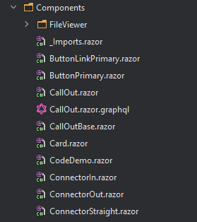
When you have these building blocks, development becomes much easier.
Need to show a button? Use ButtonPrimary
Need to call out a specific bit of information? Use Callout
The hallmarks of effective re-usable components are that they have a single, clear purpose, a small and well named ” API” (parameters) so you can easily find and use them when you need to.
But not all components are re-usable.
Crucially, to make sure you can re-use your components, they need to be decoupled from any specific business logic for your application, which brings us to…
Keep your Business logic components separate#
Sometimes you’re going to have components you want to re-use in your app, but you can’t, because they’re too specific.
Take this Card component:
Card.razor
<div class="card"> <div class="card-body"> <h5 class="card-title">@Product.Name</h5> <p>@Product.Description</p> <p>£@Product.Price</p> <p> <a href="details">View</a> </p> </div></div>@code {
[Parameter] public ProductDetails Details { get; set; }
}In practice, this is actually a ProductCard component, because it’s so tightly tied to the ProductDetails class.
But what if you want to use the same “card style” layout, but for a user’s profile?
Good luck re-using this one (unless you’re going to pretend user profiles are actually products!)
The trick here, is to separate the business logic from the more generally useful markup/logic.
So a Card component:
Card.razor
<div class="card"> <div class="card-body"> <h5 class="card-title">@Title</h5> @ChildContent <p> <a href="@Link">@LinkText</a> </p> </div></div>@code {
[Parameter] public string Title { get; set; }
[Parameter] public string Link { get; set; }
[Parameter] public string LinkText { get; set; }
[Parameter] public RenderFragment ChildContent { get; set; }
}Then a ProductCard component which delegates to it:
<Card Link="details" LinkText="view" Title="@Product.Name"> <p>@Product.Description</p> <p>@Product.Price</p></Card>@code {
[Parameter] public Product Product { get; set; }
}Now you get the best of both worlds: a handy Card component which you can use everywhere, and a ProductCard which can adopt that same card style, but focus purely on UI/Logic specific to products.
Go faster, with components#
You know when you’ve really nailed your component design when building new features feels like painting by numbers.
You’re able to take all the UI building blocks you’ve already created, and use them to build new and interesting features for your app.
Just watch out for the signs of a good component above, and there’ll be no stopping you :)
Your skills aren't becoming obsolete. They're becoming essential.
Practical engineering principles for building software that works - with or without AI.