Building a "like" button using Blazor Server
March 10, 2019 · 5 minute read · Tags: blazor
Note: Razor Components is now called Blazor Server. Bear that in mind as you read on!
Have you ever wondered how the UI for an application like Facebook is built? I mean technically, how all the different pieces are coded and pulled together to make the application tick?
Whilst we may not know the specifics, one thing is clear, they haven’t just taken all the code showing the wall of posts, comments, like buttons etc. and lumped it all together in one page!
Built on React.js, Facebook’s UI comprises thousands of components.
For example, the Like button will be one such component, with self-contained logic/behaviour (e.g. what to show when the button has been clicked).
Small components are easy to reason about (and therefore maintain) but of limited use by themselves.
The real power comes from combining multiple components together, re-using components in different contexts to make individual features which share some common functionality but behave differently.
With Razor Components, now here in ASP.NET Core 3, we have a way to build applications like this (using components) but in ASP.NET, using C# and without having to resort to a javascript solution such as React.
A simple “Like” button
In part 1 we saw how to spin up a new Razor Components application. Now let’s explore how to use multiple components and compose them into a larger feature.
We’ll take Facebook’s Like button as an example.
We can start by creating a new LikeButton.razor file and adding some basic HTML.
<button onclick="@ToggleLike" class="btn">
    <i class="fas fa-thumbs-up fa-lg"></i>
</button>
Here we’ve used the Font Awesome thumb-up icon. To make that work we’ve added a link in Index.cshtml to the FA CSS CDN (as detailed in the Font Awesome docs).
We’ve told Razor Components to expect a function called ToggleLike which it can invoke when this button is clicked. Let’s add that function.
<button onclick="@ToggleLike"
        class="btn @( liked == true ? "btn-primary" : "btn-secondary" )">
    <i class="fas fa-thumbs-up fa-lg"></i>
</button>

@functions {
    bool liked = false;

    async Task ToggleLike()
    {
        liked = !liked;
    }
}
Now the liked property will toggle between true and false each time we click the button.
We’ve also updated the button markup to use that liked property. If set to true we’ll show the Like button as a “primary” button (blue) otherwise “secondary” (grey).
So far so good, we have a fully functional like button, but we’re not using it anywhere!
Let’s say we want to show this Like button at the bottom of a Post.
Heading over to Index.razor we can reference our LikeButton component.
<LikeButton />
We can use Razor components like this one as often as we like, either by declaring it multiple times ourselves…
<LikeButton />
<LikeButton />
Or as a result of iterating over data, for example multiple posts…
@foreach(var post in Posts) {
    <LikeButton />
}
For now, we’ll just add it once, manually, with some hard-coded “Post” data.
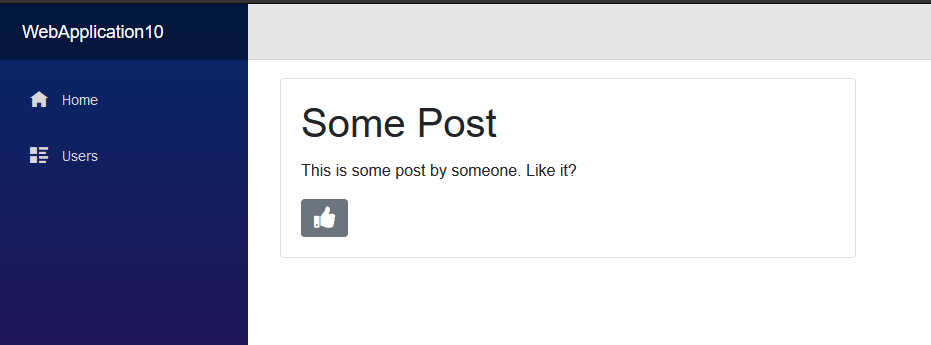
<div class="card" style="width: 36rem;">
    <div class="card-body">
        <h1 class="card-title">Some Post</h1>
        <p class="card-text">This is some post by someone. Like it?</p>
        <LikeButton />
    </div>
    <div class="card-footer">
        Liked: @postLiked
    </div>
</div>
Which gives us something like this (using Bootstrap which is included in the Razor Components project template).
Don’t call me, I’ll call you
But what about doing something when the button is clicked? Currently we just toggle its appearance but don’t do anything else.
In reality we’d want to know that something had been liked so we could update a record in the database or take some other action.
At this point it might be tempting to put logic directly in LikeButton.razor to do something when the button is clicked, but this approach is likely to result in us adding more and more logic to the Like button as more and more use cases crop up.
The beauty of a component approach is that we can keep components like LikeButton small and self-contained. Its job is simply to flag up when something is liked, then another component (e.g. our Posts list) can take appropriate action.
Let’s start by modifying LikeButton to take a CallBack…
@functions {

    [Parameter] EventCallback<bool> OnLikeToggled { get; set; }

    bool liked = false;

    async Task ToggleLike()
    {
        liked = !liked;
        await OnLikeToggled.InvokeAsync(liked);
    }
}
LikeButton can now take an EventCallback as a parameter, which it can invoke whenever it sees fit.
In this example it will invoke the Callback whenever the Like status is toggled, and will include the current state of liked.
This means, back in index.razor we can update our LikeButton declaration to do something when that callback is invoked…
<LikeButton OnLikeToggled="@PostLiked" />
In reality PostLiked would likely interact with a database to indicate that this Post was liked, but for now we’ll just flip a bool property so we can test if it’s working.
@functions {
    bool postLiked = false;

    void PostLiked(bool isLiked)
    {
        postLiked = isLiked;
    }
}
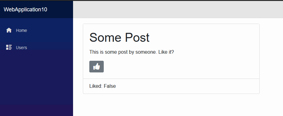
And to complete our testing, we can render the value of postLiked to check that everything works as we expect.
<div class="card" style="width: 36rem;">
    <div class="card-body">
        <h1 class="card-title">Some Post</h1>
        <p class="card-text">This is some post by someone. Like it?</p>
        <LikeButton OnLikeToggled="@PostLiked" />
    </div>
    <!-- added this -->
    <div class="card-footer">
        Liked: @postLiked
    </div>
</div>
And here it is in all its glory!
So far Razor Components look like they have a lot of potential and I’m interested to keep exploring them and figuring out how they actually work in practice.